ShopDreamUp AI ArtDreamUp
Deviation Actions


Suggested Deviants


Suggested Collections


You Might Like…


Description
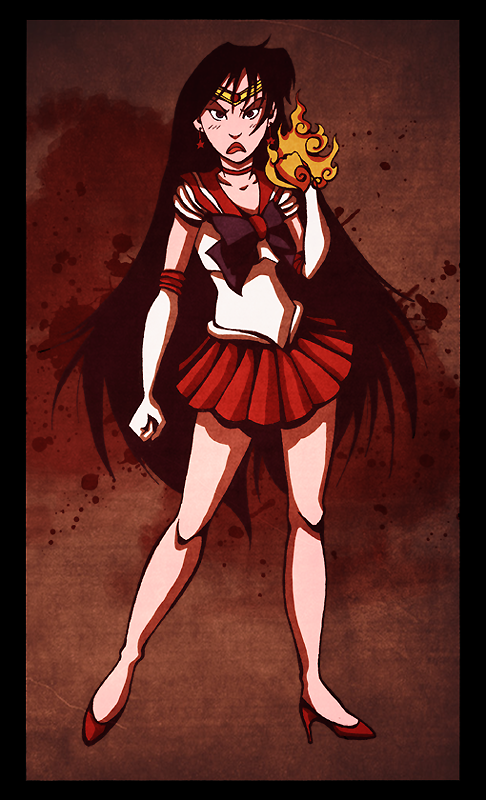
I just realized that I don't have any Sailor Moon art in my gallery, which is not right, since that's the first anime that I ever watched all those years ago. So, in homage, I'll be doing all the senshi.
Though for the life of me I don't know why I started with Mars. She's my least favorite character. e_e
Texture from [link]
Ref from [link]
Though for the life of me I don't know why I started with Mars. She's my least favorite character. e_e
Texture from [link]
Ref from [link]
Image size
486x800px 581.6 KB
Comments35
Join the community to add your comment. Already a deviant? Log In
First off, the impact of this was immediate for me. It gave off a fierce expression and a determined, almost angry look to the character. However, the first thing I would like to point out is with the lips. When trying to give an aggressive, almost triangle like turned down frown like that, it would normally be less curvy and rounded then this. When expressing displeasure, they tend to thin a bit, but press together firmly. If it helps, think of a rubber band thinning out as its stretched and bend up a bit in the middle, while the sides are pulled down.
I really do think the pose is poignant and gives a firm stance. This is good, since the closed fists do give off such a kind of determined feeling and add to the vision of the piece. The only tip I would give for the hair, is that while it would billow out, big strands, such as the tuft off to the right side of the character, would dip down rather then up as dramatically as this. Also the bangs seems somewhat thin, for how full the hair is. Maybe fill them out a bit more on the forehead by thickening them?
For the headband, try shaping it a bit wider, to and shape the top of the hair a big wider, to better even out the fullness of the hair with the shape of the hair. As the chin is somewhat sharp, and the hair near the top needs filled out a bit more to counter the overall shape of the head. You did well on the shading of the legs and skirt. It adds to the clarity of the piece to me. However, perhaps try blur or soften the sharpness of the contrast between the brightest points of the shading and the shadows by adding a transition color? This would only add to the detail and also help it from seeming a bit too hard of a contrast.
Still, nice job and you did great on the look. Please consider these as suggestions. Best of luck with your future works.